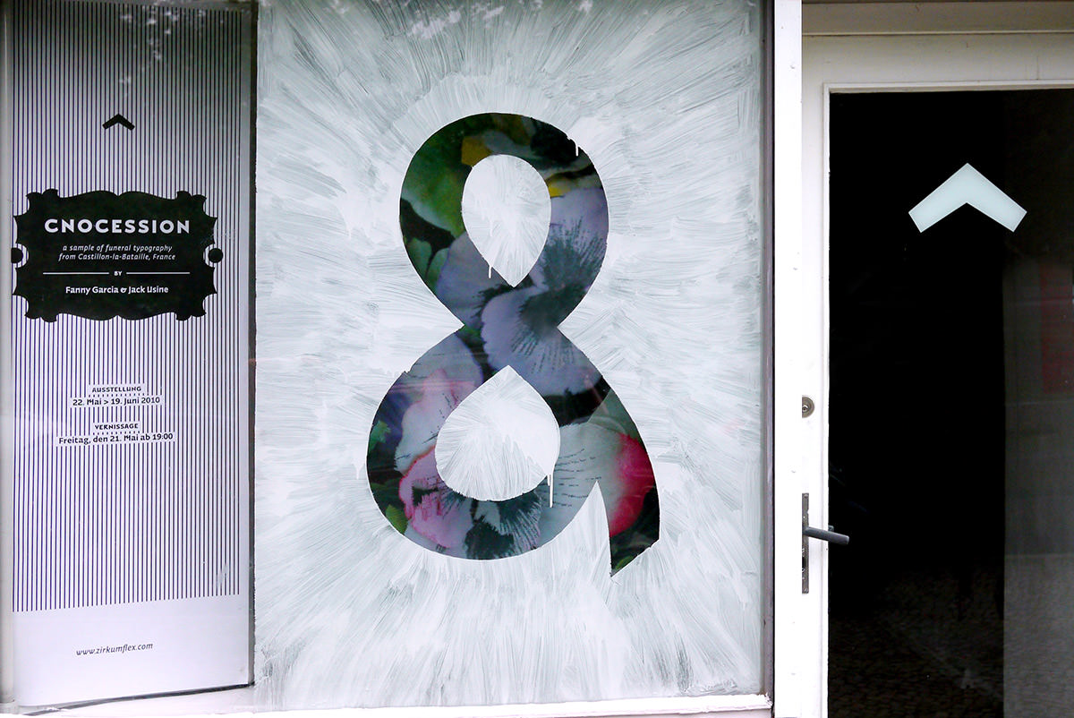
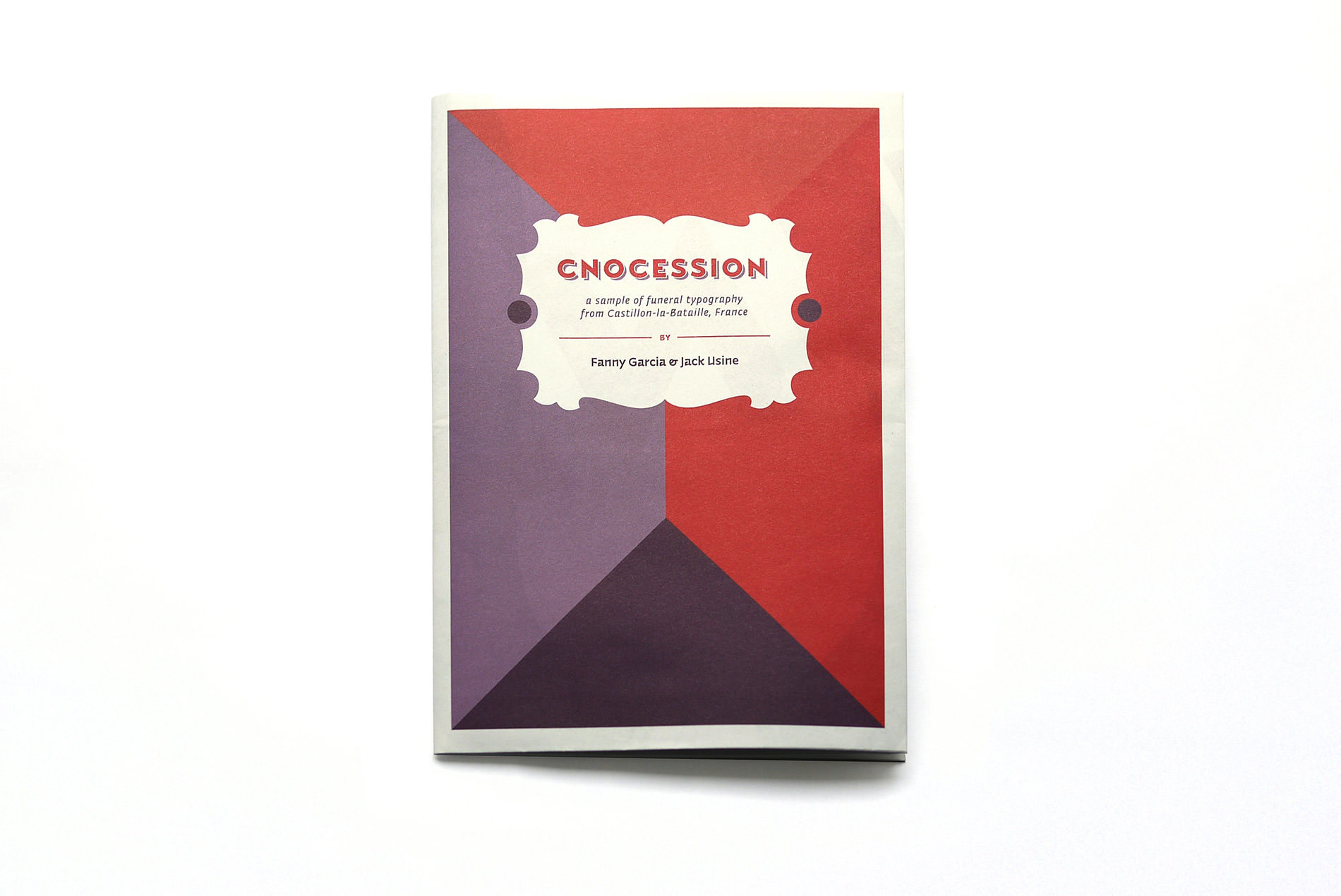
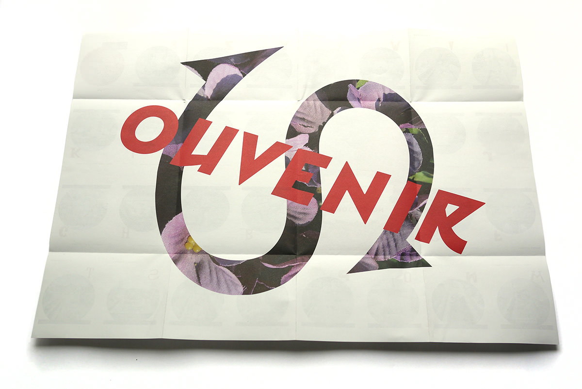
Cnocession

Technical description:
Closed size: 15 × 21 cm
Open size: 59,7 × 42 cm
Paper: 80gr/m2 recycled paper white / Der Blaue Engel
Published in 500 copies.
Twenty seven of them are numbered and signed by Fanny Garcia & Jack Usine.

Credits:
Artists: Fanny Garcia & Jack Usine
Curating by Zirkumflex
Graphic design: GUsto
Coordination: Brice Delarue
Press & public relation: Cédric Bouvard
Translation: Elisa Francesca Monte

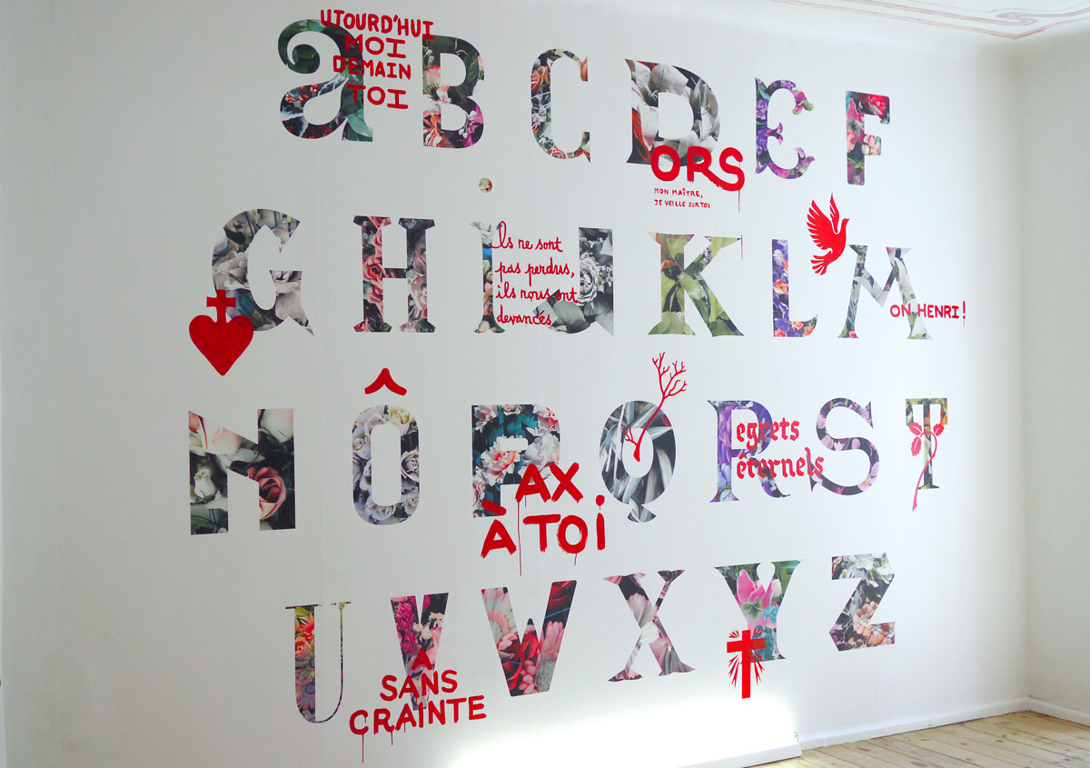
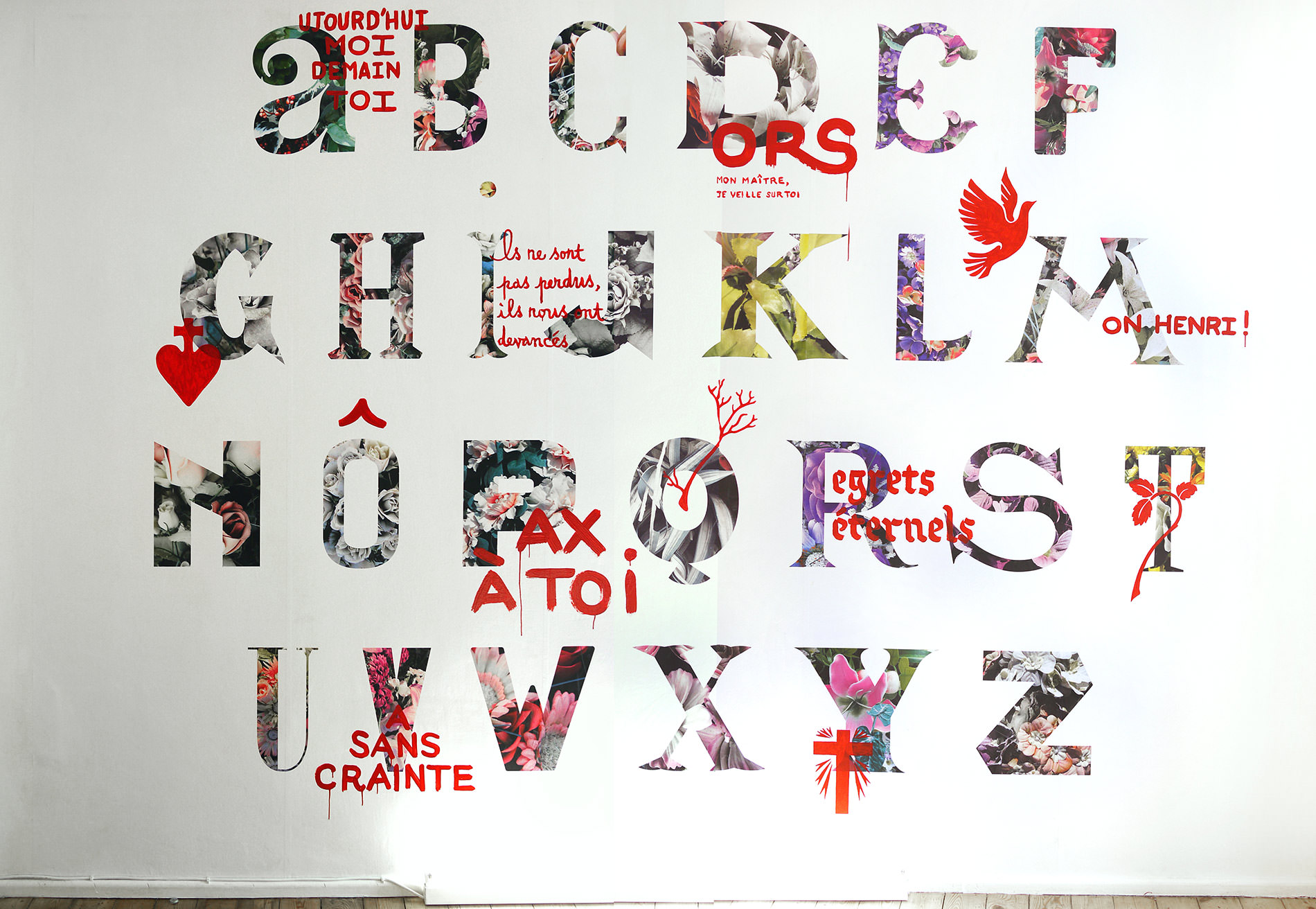
From funeral typography to a rebirth of initials.

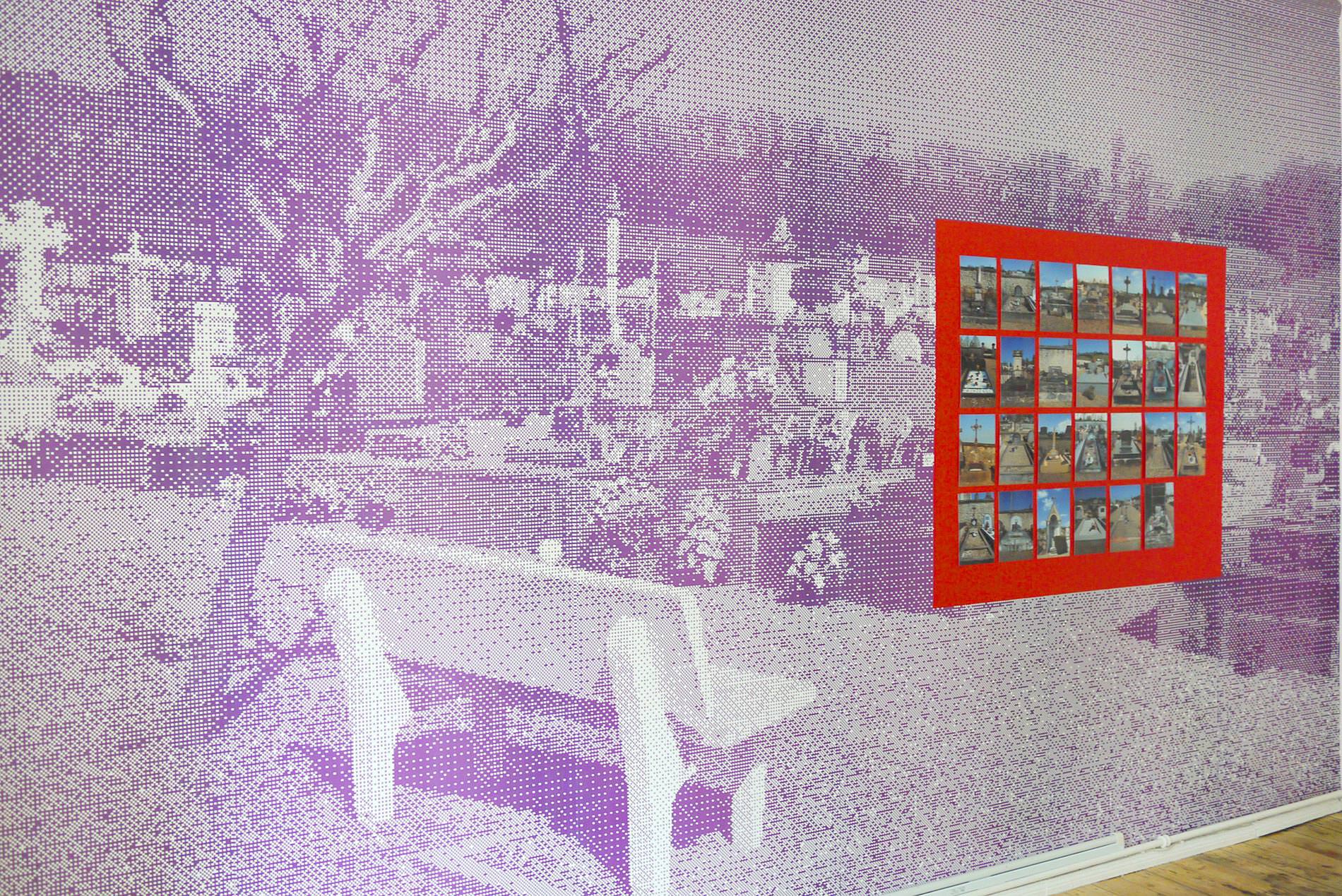
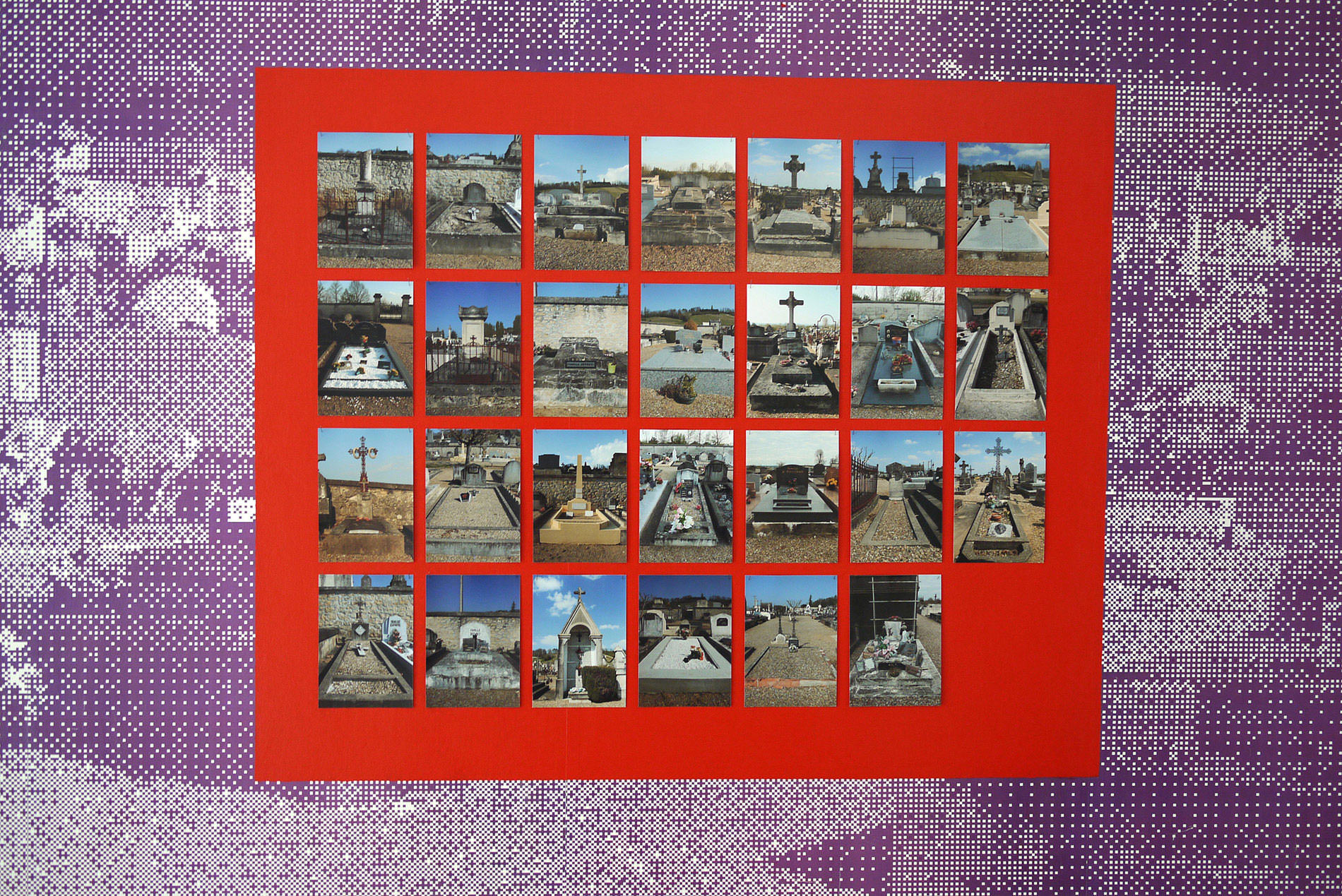
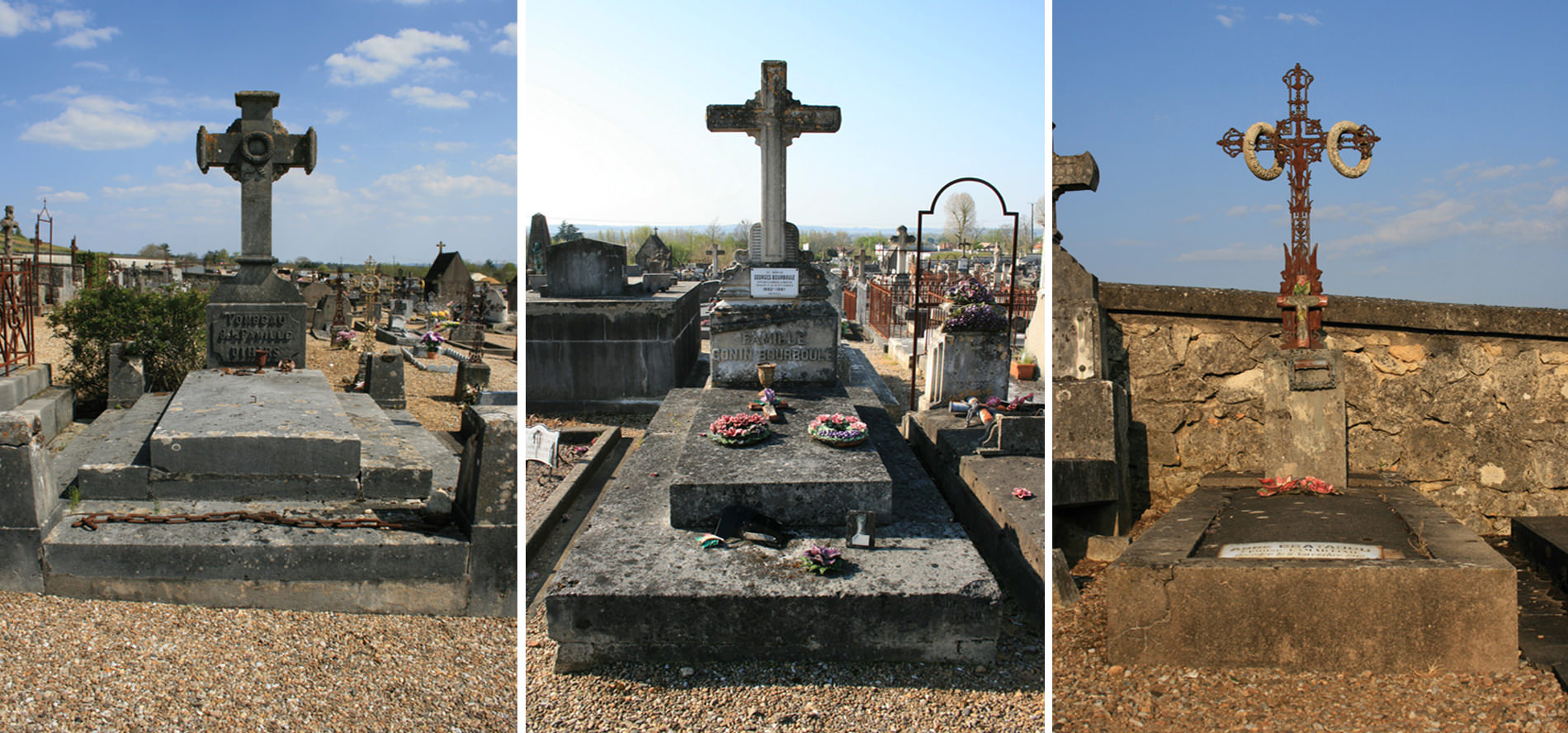
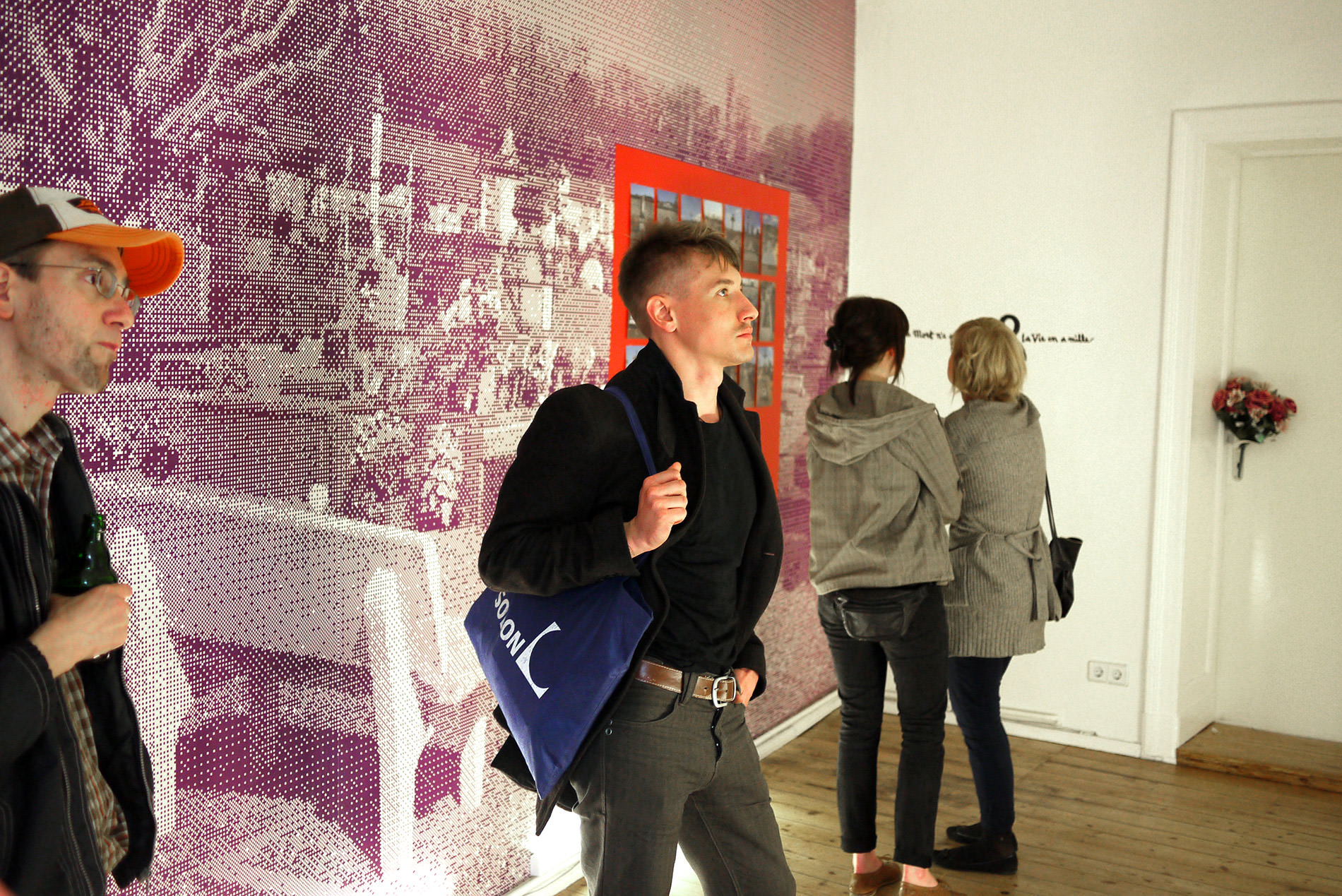
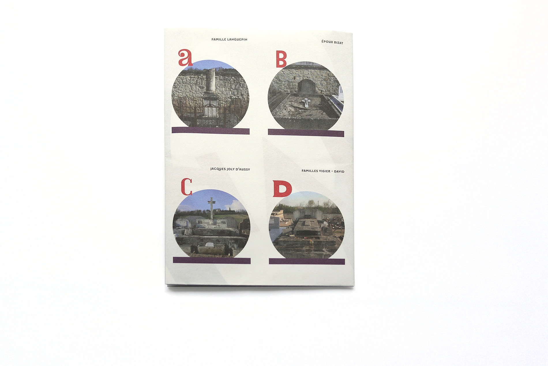
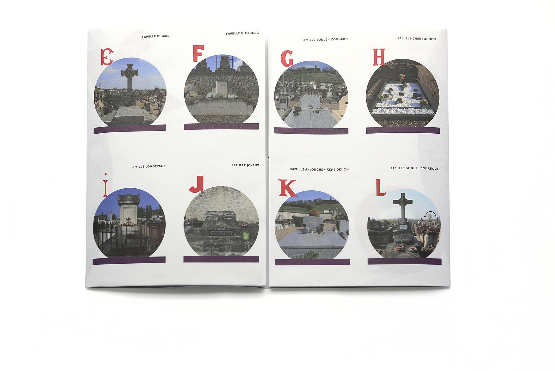
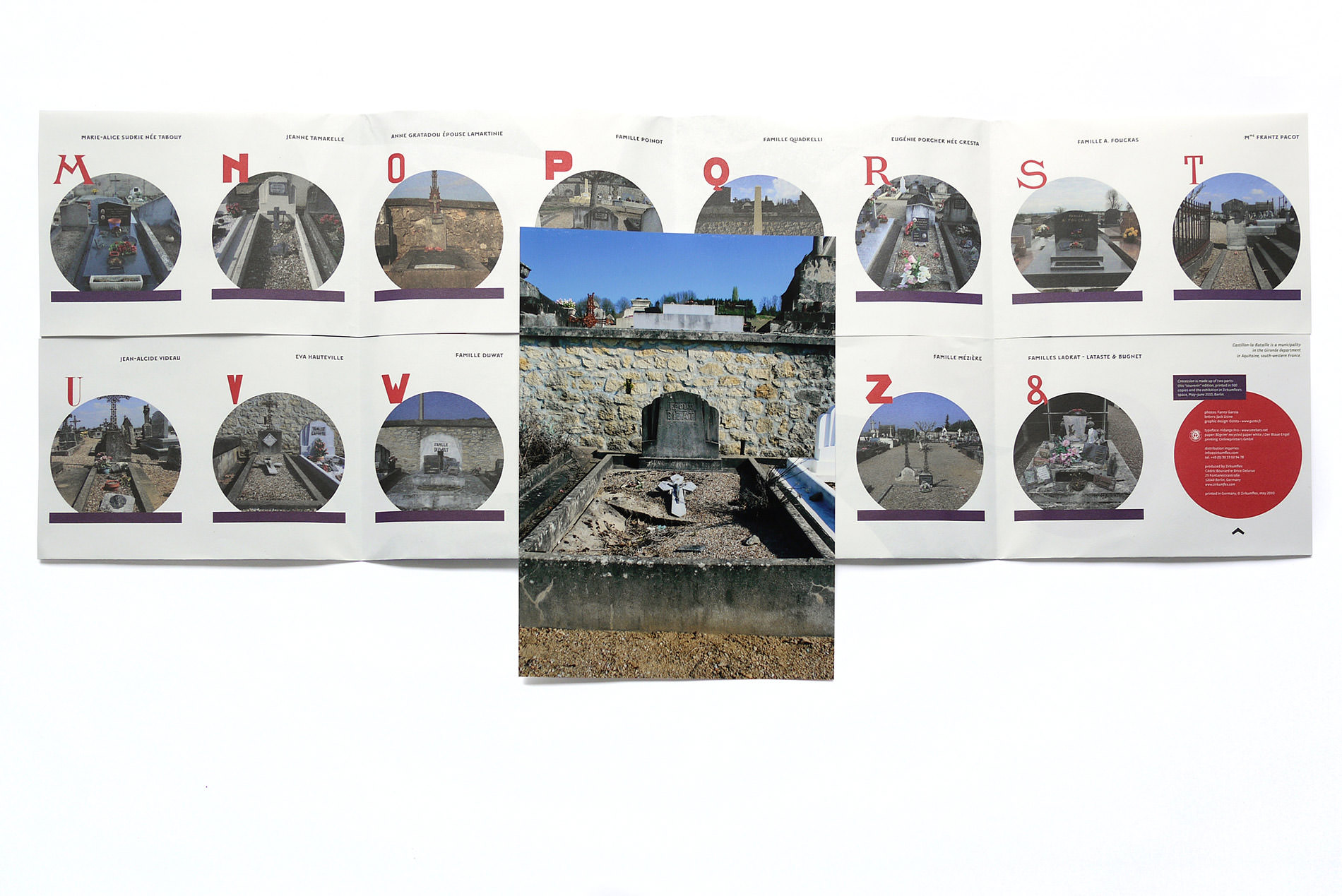
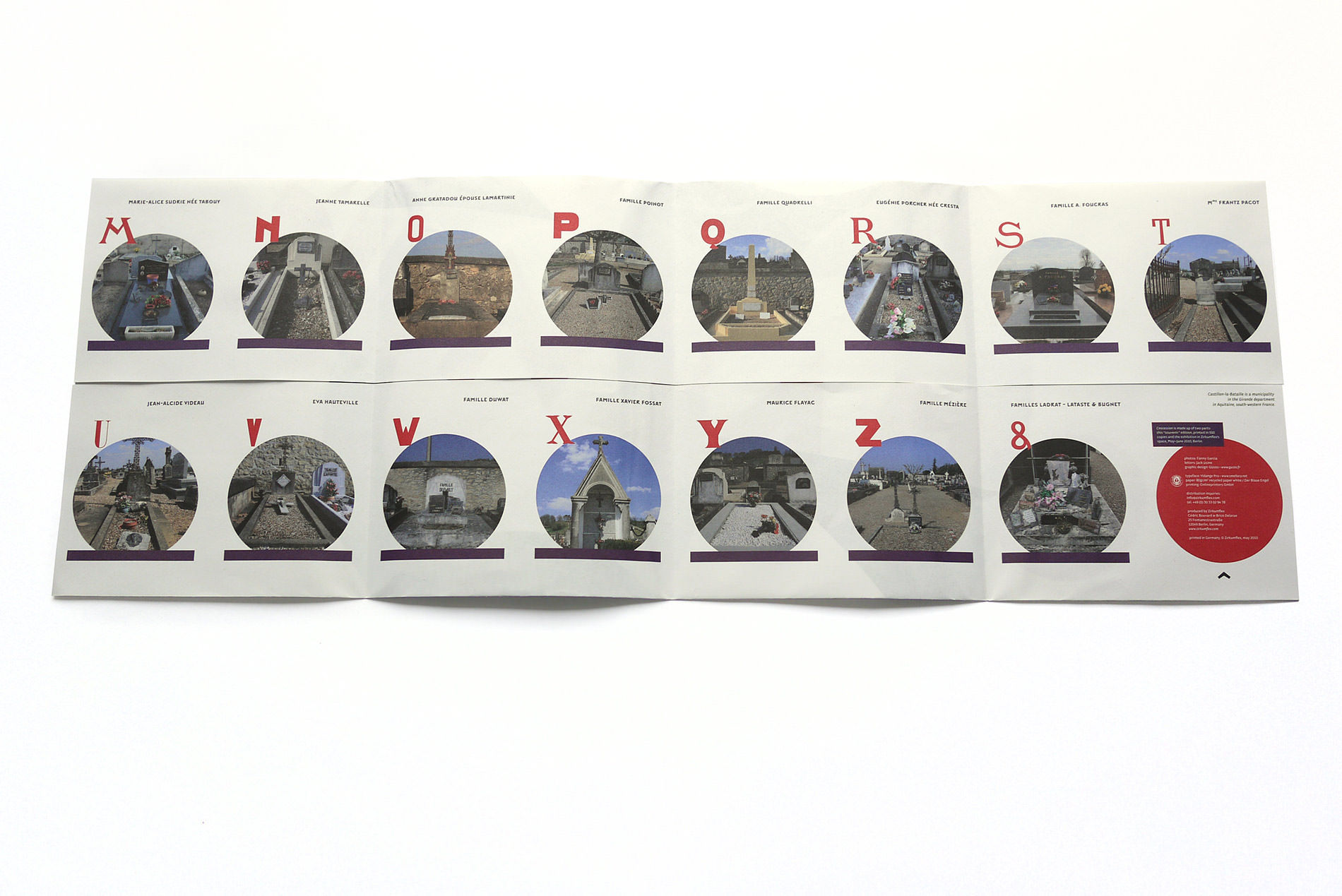
Cnocession is a project presenting a sample of funeral typography from a French cemetery. A project by Fanny Garcia & Jack Usine (GUsto) combines typography and photography. It is a creation of an abecedarium made of letters handpicked from headstones and memorial brasses in the cemetery of Castillon-la-Bataille.

The result is a patchwork of graphic shapes, gravestone architectures and floral wreaths and decorations, exposing local habits and knowledge. ‘Cnocession’ depicts the relationship between people and remembrance, giving birth to a collection of the venerable component of classical publishing: the initial.

Four questions to GUsto

GUsto (Garcia Usine Studio) is a polyvalent structure created in 2005 by Fanny Garcia and Jack Usine, graphic designer graduated from the “École des Beaux-Arts” of Bordeaux. In addition to ordinary work, the duo’s production is characterized by exhibitions and publications projects with “Sainte-Machine”, “Le Vilain” and “TT” collectives. The studio also works on the typographical creation and diffuses its typefaces via Smeltery.

What are the origins of Cnocession project?
Zirkumflex determines the starting point, suggesting us to think about the use of Initial Letter nowadays: are they dead? In cold blood and ironically, we have been to a cemetery in our town, looking for an answer…

What’s the reason of this name, Cnocession?
The name originates from a typographic misprint engraved on an headstone in Castillon-la-Bataille cemetery. This “misprint” symbolizes, for us, the “handmade” concept, the sign of a human being behind the tool, an unexpected detail which is part of a local heritage. That’s what motivates our work.

By which criteria have the letters been chosen?
The letters have been chosen in order to have a plasterboard which can eclectic and representative about the typographic matter of the place. We have favored the most unusual letters to establish harmony between the
differences of the set.

What are the aims of this project, if there are?
It’s alive!

Souvenir edition

Credits:
Photos: Fanny Garcia
Letters: Jack Usine
Graphic design: GUsto
Publisher: Zirkumflex
Typeface: Vidange Pro
Printed in Germany, © Zirkumflex, May 2010

Souvenir edition by Fanny Garcia & Jack Usine (GUsto) brings to light the basis and creative processes of Cnocession project exhibited in Zirkumflex’s space, May 22 to June 19 2010.
It consists in a collection of letters extracted from headstones and memorial brasses from the cemetery of Castillon-la-Bataille (France).